- On desktop, the smallest font size is very small, almost unreadable to me. Can we bump it up?
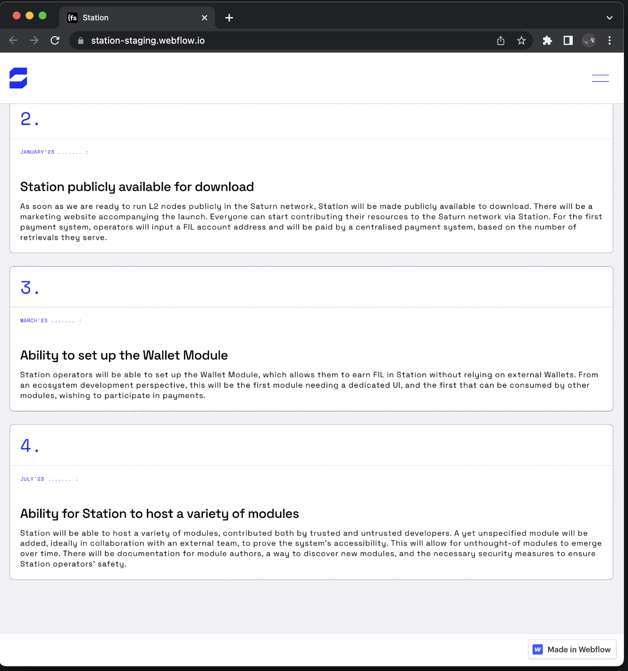
- On desktop, the roadmap milestones descriptions look cramped, I don’t think I would ever read them. Do we need to reword these to have fewer words, or could you think of an alternative layout that improves readability?
- On desktop, the opening animation of the FAQ items takes too long, I don’t think I would enjoy reading them if navigation is slow like this. What do you think about just removing the animation?
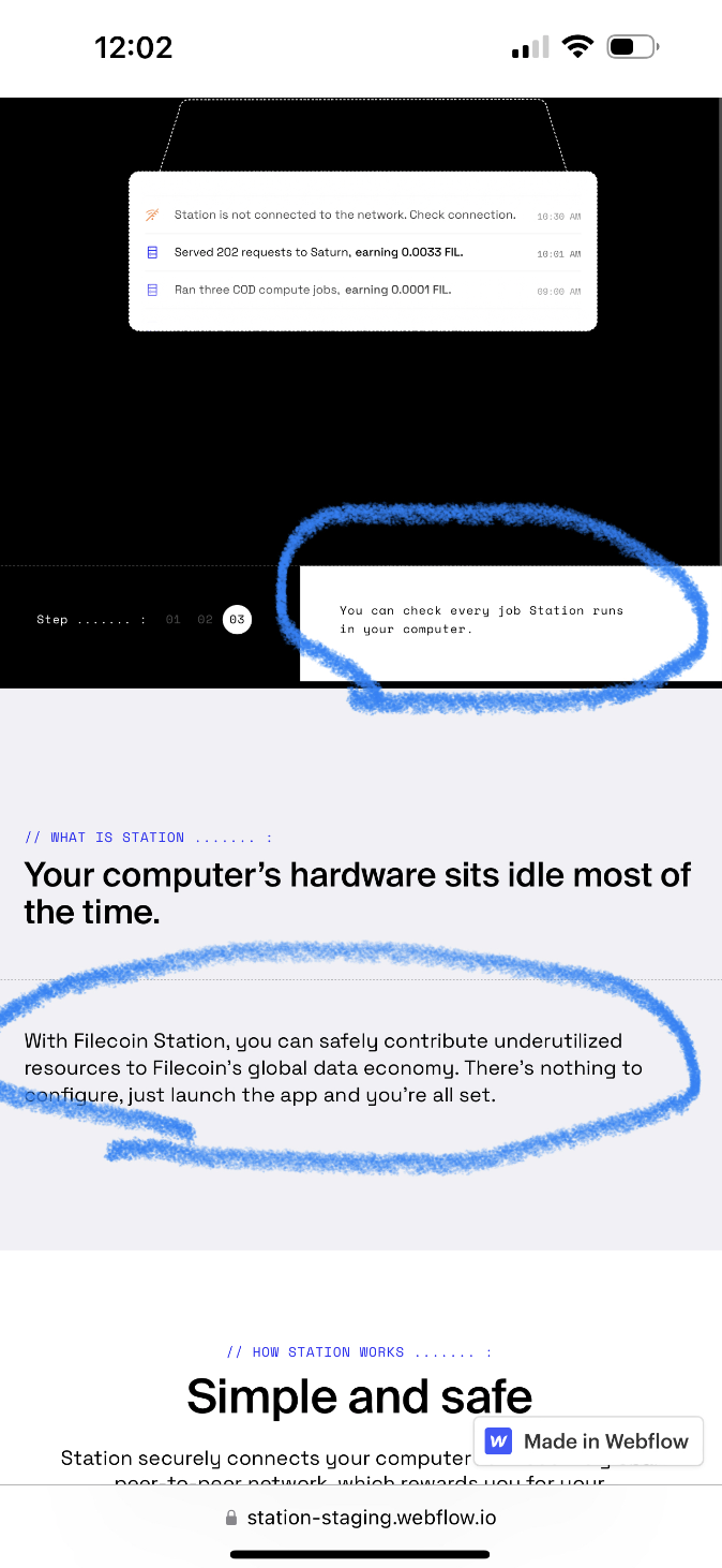
- On mobile, to me the text is too small in a couple places, although I have an iphone 14 max and usually good eyes
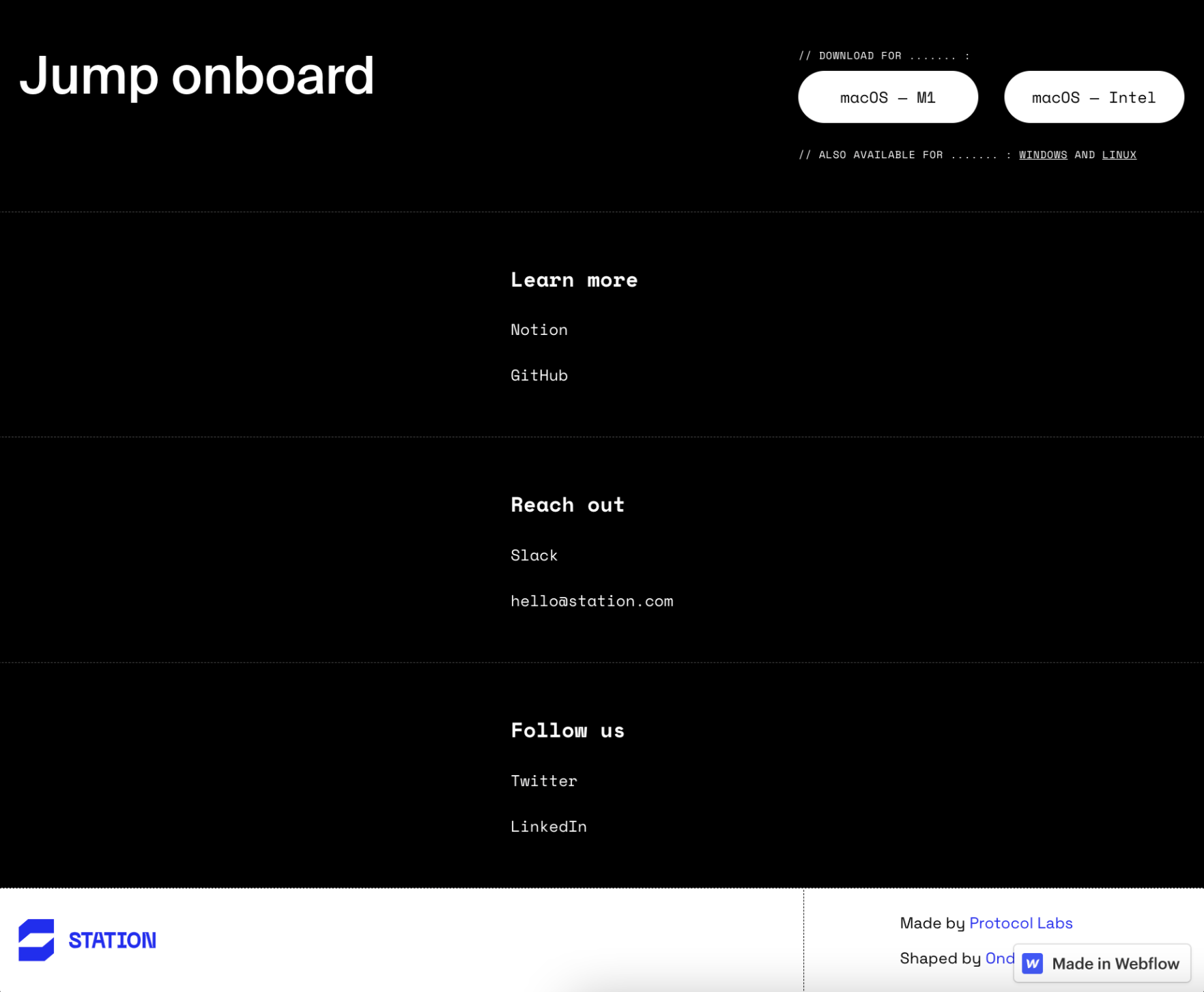
- the footer looks a bit disoriented, what do you think about left aligning the items?
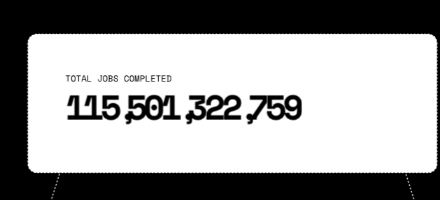
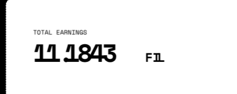
- commas and fullstops in the numbers look strange
- Do we want to link (open new tab) to GH here
- Could we avoid using “our” and instead say “Connect on Slack”